
Looking for Zhora (Above All Else, The Picture Has To Survive)
On cameras, printing, screens, distribution, and what it actually means to make images for publication now

The shift from print to screen and the illusion of back to print is brutal.
The thirty-five-year arc from paste-up to PDF/X-4 eliminated approximately a dozen discrete sources of image degradation between a photographer's original and the printed page. Yet the transition also destroyed an ecosystem of craft knowledge — the scanner operators who could read a transparency and dial in perfect CMYK separations through analogue colour calculators, the film planners who could strip a 96-page signature by hand to ±0.1 mm — and replaced it with software-mediated workflows that distribute responsibility more broadly but concentrate fewer people with deep process understanding. The current frontier is not further resolution or dot-gain improvement (returns are now diminishing) but gamut expansion through CMYK+OGV extended-gamut printing, sustainability-driven reformulation of inks and substrates, and the survival of the paper supply chain itself. For fashion photography specifically, the irony is that the printed page has never been technically better — and has never been more threatened by the economics of its own medium.
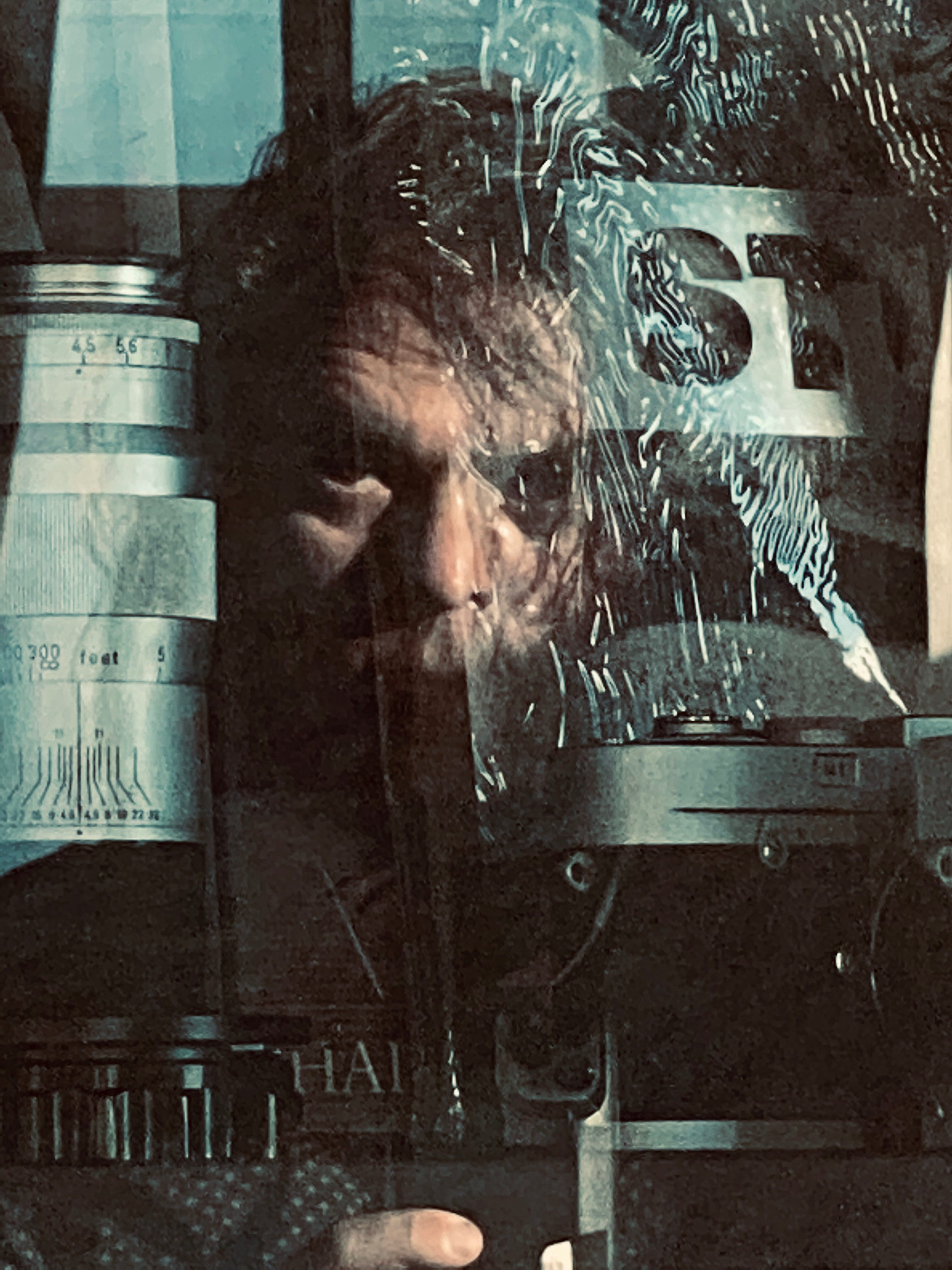
You shoot a frame on a Phase One IQ4. One hundred and fifty-one megapixels. The sensor is larger than the 35mm frame that defined professional photography for sixty years, its closer to 645 format but smaller than 6x7. The tonal gradation in the file — the way light moves from the highlight of a cheekbone into the shadow of a collar — is a physical record of photons that arrived at that specific place and moment. It’s as close to the thing itself as a photographic apparatus can get.
You upload it to Instagram.
The platform receives 151 megapixels and returns 1.46. It compresses the file to JPEG, strips the color profile, and serves a 1080-pixel-wide image to an audience scrolling at a speed calibrated to hold attention for somewhere between one and three seconds. The tonal gradation you spent the morning chasing is now approximate. The fabric texture that justified the equipment is invisible. The image that exists in the world is not the image you made. It’s what the image became after surviving the infrastructure.
That ratio — 103 to one — is the central fact of photography in 2026. And most photographers never reckon with it. They say they need the larger crop factor and it feels like Deckard looking at photos and zooming in to get that evidence.
In photography courses designed to make photographers part of the cog, we teach seeing. We teach light. We teach the relationship between the photographer and the subject. What we almost never teach is the chain that starts the moment you press the shutter — the sequence of systems, decisions, and compressions through which your image must pass before it arrives, diminished and transformed, in front of an actual human being. That chain is not neutral. It’s not transparent. It has aesthetics of its own, and it will impose them on your work whether you understand it or not.
This is an attempt to map the chain.
The photograph has always had to survive its reproduction. This isn’t new. In the Book Repetitions, Reproduction and Circulation, one of its references say.
Never before has an age known so much about itself, if knowing means having an image of objects that resembles them in a photographic sense.... Never before has an age known so little about itself. In the hands of the ruling society, the invention of illustrated magazines is one of the most powerful weapons in the strike.
And the magazine photographer has always been that warrior in the mix, next to the writer/author. In the last 70 years the photographer became the front line.
When Corinne Day handed her transparencies to The Face’s repro house in 1990, a skilled operator loaded the 35mm Ilford frames onto a Hell Chromagraph DC300 — a drum scanner with a photomultiplier tube sensor and a dynamic range that no desktop scanner has matched since — and made decisions. Real-time decisions. Adjusting contrast, pulling back shadows, compensating for the orange mask of color negative film, running the image through lookup tables tuned over years of practical experience. The picture that appeared in print was not the picture Day shot. It was the picture Day shot as interpreted by an expert who understood how offset lithography would transform it.
The repro house operator was the entire color management system. That craft knowledge, accumulated over decades, was largely lost when desktop publishing eliminated the industry between 1995 and 2005. Nobody documented it. You can’t find it in textbooks. The people who held it retired or retrained. What replaced their expertise was ICC profiles, FOGRA39, Capture One, and a standardized pipeline that any trained operator can run — which is a real achievement, and also a genuine loss.
I’m starting there because the story of how images reach the world has always been a story about intermediaries. The question is which intermediaries you understand, and which ones are working on your images invisibly.
The screen arrived before anyone was ready
In 1993, looking at a photograph on a computer screen meant looking at something rendered on a cathode ray tube at 640 by 480 pixels, at roughly 72 pixels per inch, on a phosphor surface scanning at 60 to 75 cycles per second. The image contained perhaps 307,000 pixels. A 35mm transparency scanned on that same Hell Chromagraph drum scanner contained the equivalent of 25 to 38 megapixels of information. The ratio between what was captured and what was displayable was roughly the same as it is today — the technology has changed but the fundamental gap has not.
What has changed is the screen itself. The CRT was a continuous phosphor surface. It had no pixel grid in the modern sense. It produced luminous, soft-edged images with a glow in the highlights that came from phosphor bloom — the physical spread of excited phosphors beyond the intended area. True black, because unlit phosphors emit nothing. Organic edge transitions. A quality that professional photographers and designers mourned when LCDs replaced CRTs around 2003 to 2007, and which didn’t return until OLED panels arrived a decade later.
The CRT era also gave us the 72 PPI myth, which shaped how photographers thought about digital images for twenty years and largely still does.
The original Macintosh in 1984 ran its 9-inch screen at exactly 72 pixels per inch — a deliberate choice to match Adobe’s PostScript point, defined as 1/72 of an inch. On a 72 PPI screen, one pixel equalled one typographic point, which allowed WYSIWYG correspondence between what you saw and what printed. Microsoft chose 96 PPI for Windows — a 4/3 scaling factor that produced larger, more readable text. From these two engineering decisions emerged a rule that became dogma: 72 DPI for screen, 300 DPI for print.
The print figure is meaningful. The screen figure is not.
Screens display images pixel by pixel. A 600 by 400 image appears identically whether its metadata declares 72, 96, or 300 PPI. The number in the Photoshop dialogue box doesn’t change what the monitor shows. But generations of photographers learned to export web images at “72 DPI” as though the number mattered, and it created a false conceptual separation between print quality and screen quality that prevented a clearer understanding of what was actually happening.
What was actually happening was this: the resolution ceiling for screen display was set by the screen, not by the file. And for the entire CRT and early LCD era — roughly 1990 to 2010 — that ceiling was far below what any professional camera system could capture. The gap between capture and display was so wide that it effectively put web photography outside the scope of serious photographic practice.
The LCD transition starting around 2003 solved some problems and created others. Fixed-pixel grids produced sharper, more stable images at native resolution. But early LCDs had narrow color gamut — sRGB, the standard codified in 1999, covers roughly 35 percent of visible color, a number chosen to describe what a 1990s CRT monitor could do. Professional photographers worked in Adobe RGB, which covers roughly 50 percent of visible color and encompasses the gamut of CMYK offset printing. Every image prepared for web delivery required a conversion — from the wider, print-appropriate color space to the narrower, screen-appropriate one.
That conversion was not neutral. The specific colors that compressed most visibly in the transition from Adobe RGB to sRGB were exactly the colors that fashion photography depends on: saturated reds, deep magentas, vivid oranges, the luminous cyan of a well-lit white garment. The web version of a fashion photograph was a systematically different color experience from the print version. Art directors who worked in print and reviewed web proofs on calibrated monitors understood this. Photographers who didn’t understand color management didn’t.
Apple’s 30-inch Cinema HD Display, launched in June 2004 at $3,299, was the first monitor where a magazine spread could be viewed at near-actual print size. It was a professional threshold — the moment when screen-based image evaluation became plausible for work destined for print. It required a dual-link DVI graphics card that no shipping Mac included, which tells you something about who it was built for and what they were expected to already understand.
The Canon EOS 5D launched the same year at the same price. The 5D’s 12.8-megapixel full-frame sensor was justified by print needs — it produced excellent files at 300 DPI up to about 14 by 9 inches, adequate for a magazine page. What it produced for the web was roughly 16 times more image data than any monitor could display. Camera resolution at this moment was entirely a print calculation. The web was an afterthought.
Flickr launched in February 2004 and created something that didn’t exist before: a context in which photographs were made primarily for screens, evaluated primarily by screen viewers, and succeeded or failed based on how they read at 500 pixels wide in a browser window. Before Instagram, Flickr was where a generation of photographers learned what worked on screen. Its Interestingness algorithm — deliberately opaque, incorporating comments, favorites, views, and community participation — shaped the aesthetic choices of everyone who used it, usually without their knowing it was happening.
Jack Davison found his education on Flickr. He studied English Literature at Warwick. Bought a Nikon D50 on eBay. Spent years on Flickr learning what an image needed to communicate when viewed for two seconds on a 1280 by 1024 LCD by someone who would never see a physical print of it. He shoots now on Mamiya RB67 and makes photopolymer gravures — hand-printed etchings that are the most screen-hostile objects imaginable. The path from Flickr to the gravure press is not a contradiction. It’s a logical response to understanding exactly what screens do to images, and choosing to make work that exists in defiance of those conditions.
Instagram and the formation of a generation
On June 24, 2010, the iPhone 4 launched with a 326 PPI display. Steve Jobs called it a Retina display and made a specific claim: at 300 pixels per inch, viewed at 10 to 12 inches, the human retina can no longer resolve individual pixels. The threshold is real, approximately correct for standard 20/20 vision, and its cultural consequence was immediate: for the first time, a pocket device could display photographs with the perceptual smoothness of a magazine page at reading distance. The gap between screen and print had closed in the one context where most people actually looked at photographs.
Instagram launched four months later, on October 6, 2010, into this new perceptual landscape — and immediately squandered it.
The original format was 612 by 612 pixels, square, JPEG compressed to around 70 percent quality. The square came from Polaroid and Lomography and medium format — a deliberate analog citation. At 612 pixels, the platform was displaying images at about 7 percent of the iPhone 4 camera’s native resolution. The technology to capture beautiful images and the technology to display them sharply both existed in the same device. Instagram chose compression.
This was not a mistake. It was a decision about what the platform was for.
What survives 612 pixels with heavy compression is not detail. Not texture. Not the tonal subtlety that separates a well-made photograph from a snapshot. What survives is color, mood, composition, and gesture. The image has to communicate its essential quality in roughly 375,000 pixels. If you’re working in fine fabric textures, in the subtle gradation of skin under available light, in the documentary register of Daido Moriyama or Antoine d’Agata — that work gets flattened to color and gesture. The compression doesn’t know it matters.
VSCO launched in 2011 and built a business on exactly this gap. The company sold film emulation presets — Kodak Portra 160, Fuji 400H, Tri-X, Velvia — that restored to digital images the warmth and imperfection that early DSLRs and phone cameras stripped out. The Portra 400 preset was what put them on the map: lifted shadows that never reached true black, compressed tonal range, a golden warmth in the midtones, the particular way film rolls off in the highlights instead of clipping. These were qualities that Kodak’s chemists had engineered into silver halide crystals over decades of research aimed at making photographs feel right rather than accurate. VSCO reconstructed them as mathematical transforms in Lightroom.
The VSCO era produced an aesthetic that dominated fashion and lifestyle photography from roughly 2012 to 2017. Warm, faded, grain-textured, intimate, square. The aesthetic emerged directly from the specific technical constraints of the platform: Instagram’s 612-pixel ceiling, JPEG compression that punished high-frequency detail, small phone screens viewed at intimate distance, and the cultural demand for images that felt authentic in a context saturated with commercial polish. When you understand what the platform was doing technically, the aesthetic makes complete sense.
Petra Collins, a photographer that modeled in the high fashion world and later an actress, was building The Ardorous while VSCO was building its preset library. She started photographing friends with disposable cameras, created the online collective at 17 because she said there was nowhere to show her work, and developed an aesthetic — soft focus, pastel, dreamy, unretouched, suffused with what critics called preemptive nostalgia — that was perfectly calibrated for Instagram’s visual logic. She shoots exclusively on film. Her images on screen carry a warmth and imperfection that digital capture of the same subjects in the same light couldn’t produce. The analog origin doesn’t disappear in compression. It persists — differently, degraded, but present.
Highsnobiety wrote that Collins’s aesthetic had become “one of the dominant modes of visual culture,” and then added the observation she made herself: What the fuck kind of monster did I create? She was watching her own visual language metastasize into brand marketing for mattresses, kombucha, and athletic wear. The instrument of her resistance had become the instrument of their compliance.

Campbell Addy found photography books by Nick Knight and Irving Penn in a school library during detention — the physical objects that could change someone’s idea of what photography could be. He shoots 90 percent on film. He launched Nii Journal from his student loan, funded the first issue on Kickstarter, built Nii Agency because a model he shot was told by an existing agency “we have one of you already.” His monograph Feeling Seen omits all publication credits — the work presented without its commercial context. He told AnOther that print is “a luxury now — not in the price market, but in the sense that if you buy it, it’s really because you want it.”
That last sentence is the thesis of what the printed magazine has become.
What the Retina display revealed
The MacBook Pro with Retina Display launched in June 2012. Two thousand eight hundred and eighty by 1,800 pixels at 220 pixels per inch. Every image on every website looked soft overnight.
The Retina display didn’t create new demand for image quality. It made visible what had always been true — that web-delivered photographs were significantly lower quality than the photographers who made them believed — and it did so on the working screens of photo editors, art directors, and publications. Within months of the launch, the photo industry was reckoning with what Retina resolution revealed: softness in images that had passed quality control on lower-resolution monitors, compression artefacts invisible at 96 PPI that were vivid at 220, color accuracy problems that had been hiding in the gap between editing monitor and delivery screen.
The @2x response was technically correct and commercially brutal: every image on the web now needed to be delivered at twice the CSS pixel dimensions to appear sharp on Retina displays, which meant four times the file size, which meant four times the bandwidth, which meant the image delivery infrastructure of the internet had to be rebuilt to accommodate what better hardware revealed. Publications rebuilt their image pipelines. Photographers adjusted export workflows. The entire apparatus of web image delivery underwent a quiet technical revolution that most readers never noticed, triggered by a hardware specification on a laptop.
Instagram didn’t catch up until July 2015, when it upgraded to 1080 pixels. Five years after the iPhone 4 demonstrated that 326 PPI was achievable in a consumer device. The platform had been degrading the output of Retina cameras for five years. In August 2015, it dropped the mandatory square format. Both decisions were the correct ones, and both arrived years late, and both changed the aesthetic that had built around the constraints they lifted.
The square format’s disappearance matters because it removed the one formal constraint that had been doing real compositional work. The square is not a natural way to see. Humans have binocular horizontal vision. The square is a choice — an imposition that forces both photographer and viewer into an unusual relationship with the frame. Medium format photographers know this. The discipline of 6×6 is real. Instagram’s square imposed that discipline, arbitrarily and universally, on an enormous volume of photographs. When it became optional, most photographers stopped choosing it, which revealed that the square had been doing work — creating a formal coherence in the feed that portrait and landscape formats dissolved.
The OLED moment and the end of the print-versus-screen argument
The iPhone 16 Pro delivers 460 pixels per inch through a Super Retina XDR OLED panel with 2,000 nits peak brightness and a contrast ratio of 2,000,000 to 1.
That contrast ratio is not a marketing number. OLED displays generate light per pixel — each pixel is its own light source, and when a pixel is off, it emits zero photons. True black. Not the muddy dark gray of an LCD backlight bleeding through a closed shutter, but actual absence. The contrast ratio between a lit pixel and an unlit one is effectively infinite.
For photography this changes everything about what the screen can show. A black garment against a dark background — which on an LCD dissolves into undifferentiated murk — appears on an OLED with the luminous depth that only a silver gelatin print on fiber-based paper could previously achieve. Simultaneously, specular highlights can be driven to 1,600 to 2,000 nits while the surrounding image sits at 200 to 500 nits. That luminance range is impossible in print. A printed page achieves perhaps 6 to 7 stops of dynamic range between the deepest black the press can hold and the brightest white the paper can reflect. A current OLED phone displays 14 or more stops — the difference between a tonal range that describes what a scene looked like and one that approaches what the photographer actually saw.
And the color situation has changed.
Display P3 color space — now native to every Apple device since the iPhone 7 in 2016, standard on most premium Android phones, supported by Chrome and Edge since March 2023 and Firefox since May 2023 — covers approximately 45 percent of visible color. That’s 25 percent wider than sRGB’s 35 percent. The gain concentrates in reds, oranges, and greens — precisely the zones where fashion photography makes its most demanding claims and where CMYK printing has always been most limited. The saturated red of a lip. The specific orange of an Hermès box. The deep cyan of a silk lining in direct light. Colors that sRGB compressed and CMYK approximated are now rendered on screen with accuracy that offset lithography on coated stock cannot match.
The claim that print is higher resolution and higher quality than screen has not been true in any perceptually meaningful sense since approximately 2014 for desktop displays and 2010 for phone screens. The viewing distance calculation resolves it definitively. At 12 inches — the distance at which you read a magazine — the retina threshold is approximately 287 pixels per inch. A current iPhone at 460 PPI viewed at 12 inches exceeds the threshold by more than 60 percent. A 5K iMac at 218 PPI viewed at 24 inches exceeds the threshold for desktop viewing. Screen resolution reached the perceptual ceiling of human vision years ago. What continued to develop was not resolution but color gamut, contrast, and dynamic range — the three dimensions where print never competed.
This doesn’t mean print is irrelevant. It means print is doing different work than it was before.
What print is now
A Vogue spread requires approximately 7.8 megapixels at 300 PPI. An Instagram portrait post requires 1.46 megapixels. The Apple Pro Display XDR at full 6K resolution requires 20.4 megapixels. A Phase One IQ4 captures 151 megapixels.
The ratio between capture and Instagram delivery is 103 to 1.
That ratio is not waste. Every pixel in the surplus serves something specific: cropping flexibility, future-proofing against display technologies that don’t yet exist, the economics of a single capture that must produce a feed post, a website hero, a magazine spread, and a 40 by 60 inch exhibition print from the same file. A high megapixel capture is not about any single output. It’s about surviving all of them.
The surplus also changes how you approach the subject. Knowing a 151-megapixel file will be compressed to 1.46 megapixels for Instagram does not make the photographer shoot as though only 1.46 megapixels matter. The high-resolution file creates a different relationship with the subject — finer detail is present, subtler textures are preserved, the image contains more information than any single viewing can exhaust. This density, even when never fully displayed, produces a different confidence in the photograph. The file is complete in a way that phone photography isn’t. The surplus is invisible to the viewer and entirely visible to the maker.
But the printed magazine — the physical object — is now doing work that has nothing to do with resolution.
When I ran NINESIXTYNINE, I watched magazine advertising revenue hollow out from the inside, ecomm was the primary business model although high end fashion was struggling with it (now, Amazon founder Jeff Bezos is running the Met Gala, not ironic.) The economics were unmistakable by 2010: digital could measure engagement in ways print couldn’t, and brands followed the metrics. British Vogue’s circulation peaked in the second half of 2006 at 170,000 copies and fell to 151,000 by early 2013. Dazed cut to six issues per year in early 2014 and Jefferson Hack announced it plainly: “We have finally moved from being a print publisher to being a digital-first publisher.” i-D had already cut to six issues in 2009 before Vice acquired it in December 2013.
The mainstream fashion magazine, in roughly that five-year window, stopped being a mass medium and started being a luxury object. Not as a choice but as a market response. And in becoming a luxury object, it gained a different kind of cultural power.
032c, Self Service, AnOther, Fantastic Man, The Gentlewoman — these titles didn’t just survive the transition. They defined the counter-position. They print on stocks chosen for their tactile quality. They use cloth spines. They run without advertising or with severely limited advertising, funded by cover prices of £20 to £40 that reflect actual production costs rather than an advertising subsidy. They are purchased deliberately. They are kept. Campbell Addy’s formulation is exact: not expensive in price, but a luxury in the sense that if you buy it, you really wanted it.
The printed object now means something that screen distribution cannot produce. It is permanent where the feed is ephemeral. It is intentional where the algorithm is arbitrary. It has a physical presence that demands a different quality of attention — you can’t scroll past a printed photograph in 1.5 seconds. The act of holding the object creates a relationship between viewer and image that glass and backlight can’t replicate. The grain of paper absorbs ink differently than glass reflects photons. These are not aesthetic preferences. They’re physical facts about different kinds of attention.
The independent magazine has also become the context in which photographers’ most serious work appears. Not the work they make for brands or campaigns — the work that is trying to say something. Zoë Ghertner’s Hermès campaigns are beautiful. Her work in The Gentlewoman is what she’s actually thinking about. These are related but distinct registers. The printed magazine is where photographers declare their position.
The photographers who understand this
The generation that emerged through Instagram has something in common that isn’t immediately legible if you look only at the aesthetics. They all built self-publishing infrastructure alongside their photography. The Ardorous. Me and You. HOME. Nii Journal and Nii Agency. HARD EARS. SHOWstudio’s philosophy of screen as creative medium, extended into a new generation’s practice.
These platforms do what Instagram cannot. They provide editorial context. They establish the conversation a body of work belongs to. They create community that isn’t algorithmically mediated. They allow a photographer to say not only here is the image but here is why it matters, here is the tradition it responds to, here is the world it comes from.
And almost all of these photographers shoot on film.
This is the paradox that the screen created, and it deserves to be stated clearly: the generation most shaped by screen-first distribution, whose audiences are primarily screen audiences, whose careers were enabled by Instagram’s distribution infrastructure — this generation gravitates overwhelmingly toward analog capture. Film as resistance is the least interesting explanation. The more interesting explanation is what film actually provides in the specific conditions of 2025.
Film reasserts the photographer’s authority on set. The moment you tether a digital camera and a monitor appears, the dynamic shifts. The art director, the stylist, the client, the brand representative — they’re all looking at the same image simultaneously, and they all have opinions, and those opinions arrive before you’ve moved. Peter Lindbergh called the monitor “the crime” of digital photography. He wasn’t wrong about what it did to the creative dynamic. Film’s opacity — results visible only after processing, evaluation impossible in the moment — restores the photographer’s singular authority. “On set, shooting film demands trust in the photographer,” Zoë Ghertner has said. “The attention is then on the subject and the moment and not on a digital screen.” Alasdair McLellan frames it even more simply: when I shoot on film, everyone is gathered around the subject. When other photographers shoot digital, everyone is gathered around the screen.
Film also produces images whose visual character survives screen compression with a warmth and density that native digital capture doesn’t match. This sounds like mysticism but it has a technical explanation. Film grain is stochastic — randomly distributed — while digital noise follows sensor-pattern regularity. Film’s tonal curve compresses highlights gradually, producing the soft rolloff that VSCO spent years trying to simulate mathematically. Film’s color science reflects decades of engineering toward pleasing rather than accurate reproduction. When a Kodak Portra 400 frame is scanned on a Frontier SP-3000 and uploaded to Instagram, it arrives carrying a set of analog characteristics that digital capture and post-processing can approximate but never exactly replicate. The irony is structural: the medium most hostile to digital distribution — requiring physical chemistry, processing, scanning, digitization — produces images that feel most at home on the screen.
And film, developed and printed by a human in a darkroom, or scanned and minimally corrected by a trained lab technician, is harder to retouch. Which, for some photographers, is the point.
What it means to start a magazine or shoot for one
If you’re starting a publication in 2026, you’re making three different objects simultaneously, and you need to understand all three.
The printed magazine is a luxury counter-medium. Its production chain runs from the photographer’s original capture through a Capture One workflow (not Lightroom — the color management and tethering capabilities of Capture One are not comparable, and the difference is visible in print), through color-managed CMYK conversion using FOGRA39 or FOGRA51 profiles depending on your printer and paper stock, through a print-ready PDF prepared to PDF/X-4 specifications with embedded output intent, to a specialist printer — Park Communications in London, Graphicom in Vicenza, Pureprint in the UK — running CTP plates on a Heidelberg Speedmaster or manroland Rotoman, on paper chosen for how it handles ink. The difference between 80 gsm gloss coated stock and 115 gsm uncoated silk is not merely tactile. It changes how color reproduces, how shadow detail reads, how grain in film photographs renders on the page. Munken Lynx uncoated gives you the warm, absorbed quality of the independent magazine aesthetic. M-real Galerie Fine Gloss gives you the clinical precision of Vogue. Both are legitimate. Neither is neutral.
The website is a different object governed by different physics. Display P3 color delivery to Retina displays. Images prepared at 2× CSS dimensions for sharp display on HiDPI screens. JPEG at 80 to 85 quality in sRGB for maximum compatibility, or with P3 ICC profiles for wide-gamut-aware browsers. The difference between what your images look like on a calibrated Eizo and what they look like on an uncalibrated Dell IPS in an office is real and not solvable — you’re designing for a range of viewing conditions, not a single one. This is why soft proofing in Photoshop with simulated browser rendering is more than a technical exercise: it tells you whether your tonal range and color choices survive the range of conditions in which people will actually see your work.
The social feed is a third object with its own logic and its own costs. Instagram at 1080×1350 portrait with moderate sharpening pre-applied, exported in sRGB, uploaded over WiFi. Stories at 1080×1920. The aesthetic choices that work in a feed — strong color identity readable at thumbnail scale, emotional immediacy communicable in two seconds, compositional clarity that survives aggressive cropping — are different from the choices that work in a magazine spread, where the viewer has time, and different again from what works on a website, where the image functions differently depending on screen size and context.
Most photographers default to one of these three worlds and treat the other two as afterthoughts. The photographers who make consequential work in 2025 understand all three — and make deliberate choices about which to prioritize and when.
There’s a practical decision tree here: What is the primary delivery context for this body of work? If the answer is the printed magazine, shoot at the highest resolution you can justify, in the format that best serves the print specs of your target publication, with color managed for the paper stock and press condition you’re working toward. If the answer is screen — web editorial, branded digital content — shoot digitally, deliver in P3 or well-managed sRGB, optimize for Retina delivery. If the answer is the social feed, understand that you’re working at 1080 pixels maximum and nothing beyond that will survive, which means every formal choice should read clearly at that scale.
The complexity arises when — as it almost always does — the work needs to live in all three simultaneously. And the answer to that complexity is not a technical solution. It’s an understanding that the master file is the thing, and every delivery context is a specific transformation of it. You shoot at 60 megapixels not because any screen demands 60 megapixels but because the master file needs to survive every possible future reduction with integrity intact. The surplus is the margin. You’re not giving the audience all those pixels. You’re keeping them for yourself.
The thesis, stated plainly
The distribution chain is as much a creative decision as the camera you shoot on or the film stock you choose.
In 2026, I am doing a hybrid affront. Part live event, part street campaign as editorial delivery method and then print as in person distribution.
The photograph doesn’t end when you press the shutter. It passes through systems — chemical, digital, optical, algorithmic — that each transform it in ways that are either invisible to you because you don’t understand them, or visible to you because you’ve done the work to trace the entire chain.
I closed my agency NINESIXTYNINE in 2024 because I wouldn’t cross a line with generative AI. That decision was about the chain — specifically, about what happens when a system is trained on photographs made by photographers without their knowledge or consent, and then produces derivative images that circulate as though they have the same relationship to the world that photographs do. The image as Licensed Witness to a specific moment, in a specific place, between a specific photographer and a specific subject — that relationship is the foundation of everything photography means. A generative image has no witness. It has no presence. It is an aggregation of prior representations, not a record of something that happened. But it wasn’t just about the image. I shuttered my agency because I could no longer help people, I really don’t give a fuck about shooting products for a mega-oligarch’s bread and butter. That has zero cultural relevance to me.
The chain I’m describing in this piece — from sensor to drum scanner to CTP plate to JPEG to OLED display — is a chain of transformations, alchemy if you heard it 900 years ago, but it is not the same kind of transformation. A photograph that passes through the chain still points back to the moment of its making, this is what a live event calls to. Compressed to 1.46 megapixels and served by an algorithm, the photograph still carries its origin — in real time. The witness relationship persists, diminished and mediated, but present.
Understanding the chain doesn’t mean surrendering to it. It means knowing exactly where your work is being transformed, by what, and in whose interest — and making choices that preserve what matters to you about the image across as many transformations as it has to survive.
If you’re starting a magazine, that understanding is the foundation of everything else. The camera. The film or the sensor. The lab or the color pipeline. The pre-press workflow. The paper and the press. The web delivery infrastructure. The social strategy. None of these is a purely technical decision. Each one is a statement about what the image is, who you’re making it for, and what you believe photography is capable of doing in the world.
The photograph has always had to survive its reproduction.
Now it has to survive three simultaneous reproductions, in three different physical systems, reaching three different audiences at three different scales, and still mean something.
That’s the work.
Bil Brown publishes PERSPECTIV at perspectiv.substack.com and edits Black & Grey magazine. His documentary archive “This Is Very Bad” has documented protest in Los Angeles since 2016, his MYLAR series has been in ARTFORM and on gallery walls even NFTs. He shoots exclusively on Leica cameras, digital and film.